Every three years since the first major redesign of Oregon’s uniforms for the 1999 season, the Ducks have changed their look after three years. On that schedule, the current look—with its signature gladiatorial-style Duck feathers on the shoulder—is in its third and, presumably, final year. Assuming a change is coming next year, what might Nike’s next version of the uniforms look like?
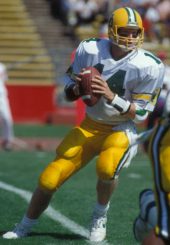
Bill Musgrave
For a generation of Oregon teams in the 1970s and ’80s (mostly in the Rich Brooks era), the look resembled the Green Bay Packers: yellow helmets and pants, green jerseys at home and white on the road. The sleeves changed (stripes, the Donald Duck logo, player numbers), as did stripes on or off the sides of the pants and the middle of the helmets.
But the basic look remained constant from Reggie Ogburn to Chris Miller, Bill Musgrave to Akili Smith. In these days, of course, the helmets also featured the interlocking “UO” logo.
Joey Harrington in the first uniform change…
The first redesign, worn for the first time during Joey Harrington’s Sun Bowl winning campaign in ’99, featured green helmets, jerseys with a yellow stripe down the sides of both the pants and jerseys. The simplicity of the uniform design, and its then-innovative manner of making the pants-jersey-helmet combination seem like one superhero-like uniform, made these perhaps the best of Nike’s three redesigns
The bib-like swatch of darker green on the chest of the uniform was the only misstep; many fans mistook it for black. It also introduced Oregon’s “O” logo, probably the best contribution Nike has ever made to Ducks athletics. Away uniforms in that era were white pants and jerseys with a green and yellow stripe also going down the sides of the pants and jerseys.
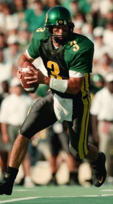
The next generation of uniforms from 2003-2005, associated with players like Kellen Clemens, Terrence Whitehead and Devan Long, featured green jerseys with yellow sleeves—or vice versa—and green pants with a yellow blob on the side of the pants.
Terrence Whitehead 2003
This was when Nike’s penchant for interchangeability really began to bloom. It was also the debut of Oregon’s occasional all-yellow jersey and pants combination, which incurred merciless ridicule in the press but seemed to accomplish the athletics giant’s larger goal of gaining attention, something ESPN’s Grantland explored recently in an article called “How Does Oregon Keep Winning?” In this era of uniforms, like in Harrington’s, the helmets were always green with a yellow logo.
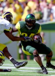
Jonathan Stewart, Dennis Dixon and the ‘D Boys’ group of defensive backs wore what was arguably Nike’s least successful Ducks kit from 2006-08. Although it was during this era that new line of white helmets was introduced, the jersey and pants both featured a pattern that looked like either diamond plating or tire treads. The tone of the green in these uniforms also grew closer to brown, which, along with the faux plating, seemed to imply a military look.
Oregon QB Dennis Dixon
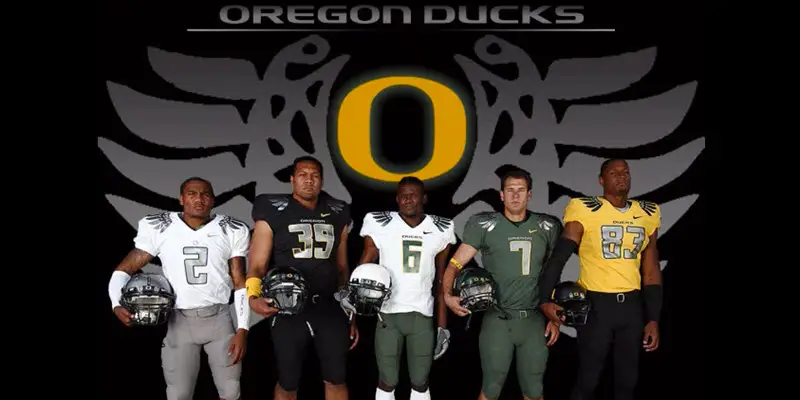
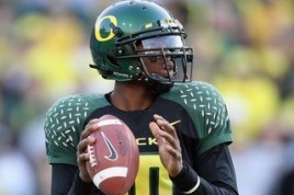
The current kit began in Oregon’s Rose Bowl year of 2009 after a sneak preview at the end of the season before. This time around, Nike introduced two new Oregon Ducks colors, or at least accent colors: black and silver (or “carbon” as it is officially known). At times, the Ducks have the capacity to look not like the Green Bay Packers anymore but the Oakland Raiders. The seminal Halloween ’09 showdown with Pete Carroll’s USC Trojans, for example, featured an all-black look. With carbon and black helmets joining the green, white and yellow combinations, the current kit added to an already dizzying array of uniform combinations.
Walter Thurmond
But these kits’ signature element was the aforementioned gladiatorial feathers. This is the one graphic creation of Nike’s besides the “O” logo itself during the post-redesign era of 1999 onward that has managed to gain traction with fans and in apparel. Hats and shirts, for example, often feature the “O” logo with duck-feather laurels on either side. We know that Nike’s stated goal is to embrace change and even controversy itself. But would they, and the university, really be so willing to abandon a graphic identity that Duck fans have been attached to?
What’s more, though it’s the future that matters most in the Duck program, the gladiatorial feathers have caught on in what is Oregon’s best two-season run in school history in these uniforms, reaching the Rose Bowl, then the BCS title game the year after, and now possibly on another historic run this season. Do Oregon’s fans really want to say goodbye to the look of their greatest moments?
The one other wild card in this conversation is the Ducks’ throwback uniforms to the Brooks era, featuring yellow helmets and pants with green jerseys. This kit was worn twice during the 2009 season: once against Cal and again, in a modified version (white pants) in the Rose Bowl-clinching Civil War.

The throwbacks worn by Oregon QB Jeremiah Masoli (2008-09) were greatly celebrated by fans
If Nike really is planning to unveil a new kit for the next three years of play, one can’t help but feel tempted to offer advice. After the three years of the diamond-plated uniforms, I wanted to grab someone from the Beaverton company by the lapels and shout, “No faux!”
Football players don’t need fake diamond plating to look tough. They are tough. But the gladiatorial feathers, which are also a kind of faux graphic element (as opposed to, say, stripes), have grown on me. They recall the warriors of ancient Greece and Rome, where athletic competition was born. Yet the inclusion of feathers in that presentation makes the design feel slightly whimsical as well—something we have to embrace with a team called the Ducks.
Given Oregon’s spring game camouflage and Chip Kelly’s otherwise laudable embrace of the military, one also has to caution Nike not to go too fully into the notion of Ducks football team as paramilitary unit. The occasional chevron on the sleeve notwithstanding, no camouflage, please!
If looking to other teams wearing Nike-designed uniforms, or to Oregon’s modifications of its current kit for the BCS national championship game or this year’s (2011) debut against LSU, there are more possible design elements to keep in mind.
With several schools, Nike has created a pattern that is loud when you see it close up but melts away when seen from a distance. This allows a modern loudness and cleverness, but does so within the confines of existing uniform tradition. This has been done with Duke’s basketball uniforms, for example, as well as Oregon’s baseball uniforms (where the words to the fight song make up the pinstripes themselves).

The Nike Pro Combat uniforms were worn in the BCS championship and vs. LSU
There is also the increasing trend of using the sleeves of the shirt underneath the jersey and pads as a part of the design, as with the yellow sleeves that stood out as the yellow portion of Oregon’s BCS title-game look, and has also become a key component of other teams’ kits. Might something loud happen on the sleeves of Oregon’s players’ undershirts and a calmer demeanor be found in the jerseys?
Given how the last few generations of uniforms have gone without a stripe on the pants (or jerseys), and how there was a black stripe subtly visible within the pants of the most recent “Pro Combat” kit used for the 2011 LSU game, one also wonders if Nike might return to a stripe.
If so, let’s hope it’s just that: a simple, linear line on the side of the pants extending all the way from belt to knee, and not a blob like the Clemens era or a stripe wandering all over the uniform as it does in Nike’s design for the Miami Hurricanes.
We all have our personal tastes and opinions regarding the uniforms and their changes over the years. I, for example, liked the Harrington-era original redesign. Has Oregon ever looked better aesthetically than the day they won the Fiesta Bowl? Stripes make interchangeability more difficult, but drawing a little from Oregon’s past striped uniforms might make for a change of pace that also stands the test of time when we watch footage of these games two decades from now.
Of course, as a 39-year-old I, like a lot of Duck fans, am too old to be an arbiter of contemporary tastes. And it goes without saying that winning is more important than any uniform. Even so, what you wear says a lot about you as a team, as a program, and all the fans you represent. The uniforms become the launching point for countless t-shirts, hats and other merchandise. So in a certain respect, Nike is designing for all of us. Far more often than not, the company has been successful in its designs for the team.
More than any other school, Oregon’s uniforms are a defining element of their transformation of image into a winner.
Brian Libby
Portland, Oregon
Top Photo from Video of UO Sports Media
Related Articles:
Brian Libby is a writer and photographer living in Portland. A life-long Ducks football fanatic who first visited Autzen Stadium at age eight, he is the author of two histories of UO football, “Tales From the Oregon Ducks Sideline” and “The University of Oregon Football Vault.” When not delving into all things Ducks, Brian works as a freelance journalist covering design, film and visual art for publications like The New York Times, Architect, and Dwell, among others.