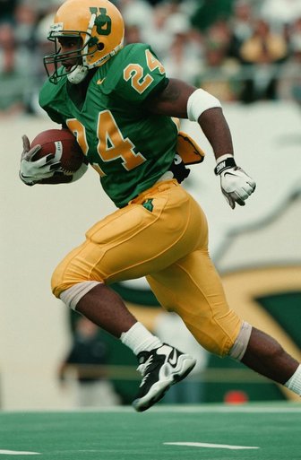
A University of Oregon game in 1998.
Duck fans are sucked into team fervor for several reasons. First off, it’s the Ducks’ incredible talent — but it’s also their outrageous uniforms.
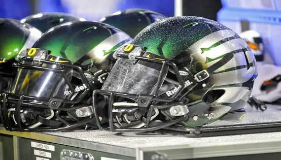
Throughout University of Oregon football history, the Ducks’ uniforms have progressed from basic green and yellow school colors to intense neon green and lightning yellow. Not many other teams can quite say they have the same flare as the U of O football athletes. And even then, the uniforms just keep progressing.
I believe it all started with our beloved Phil Knight. The co-founder of the Nike brand, Knight, is an alumnus of U of O. He is generous to a fault in making sure that the U of O teams have everything they need to excel in their athletic programs. Luckily, Nike has been a part of Oregon’s athletic program since 1995 and is still around today.
Since 1995, Oregon’s uniforms have benefitted from high-quality design. In 1999 they took another turn for the better. That year, the uniforms were reinvented by Nike to have a re-designed “O” emblem on the side of the solid green football helmets and lightning yellow letters on the jersey. Needless to say, the college football uniform game would never be the same again.
Oregon has managed to dish out incredibly flashy uniforms. The team surprised its adoring Duck fans with a total of nine different uniform combinations in 2005 with even more combinations in the years following. The Ducks have moved through the very eye-catching neon colors to “throwbacks,” and even to multiple different uniforms, such as those they wore for breast cancer awareness.
Many of the younger generation, particularly potential recruits, love the idea of these ostentatious jerseys and stand-out helmets; however, there are many who don’t like the idea of non-traditional takes on football uniforms. The U of O’s uniform designs have sparked controversies in the past. Some argue that Nike and the football team are using these uniforms as a way to effectively recruit and draw greater attention to the program.
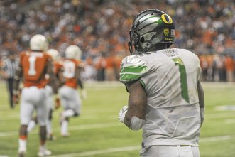
Josh Huff at the 2013 Alamo Bowl game.
In some cases this could be true. Who doesn’t want to be out on the field with colors bright enough to give off the aurora of a literal limelight? But it’s not illegal and it is an intelligent tactic. Thanks to the U of O designers, the team in green is sure to stand out.
Overall, I think we can all agree that the Duck football team looks great in their crazy, quacky uniforms. The uniforms excite the fans and give them even another reason to anticipate upcoming seasons. Fans never have problems differentiating the Ducks from their opponents.
We fans already know our football team is extremely talented and that the uniforms may not contribute to the athletes overall talent, but it sure helps to have that extra eye-candy while watching our Ducks dominate year after year!
Top photo by Kevin Cline
Related Articles:
Kerry is currently a Freshman at the University of Oregon and is studying to major in Cinema Studies with a minor in Journalism. She is from Los Angeles. She grew up watching and observing sports, basketball being her favorite. Kerry has been a cheerleader her entire life and loves being a part of the spirit of the game.