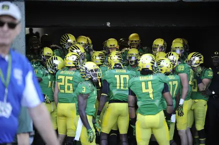
As Oregon’s 2012 season began on Saturday, not only were quarterback Marcus Mariota and a host of new Ducks making their playing-field debuts, but so was the latest generation in Oregon’s constantly-evolving collection of uniforms.
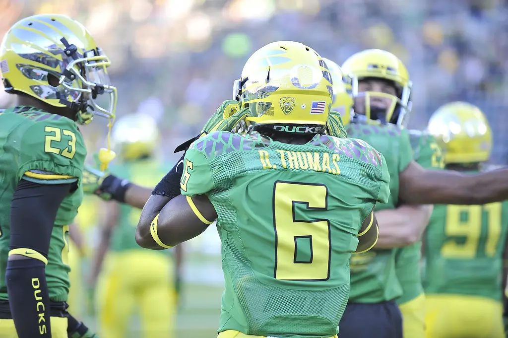
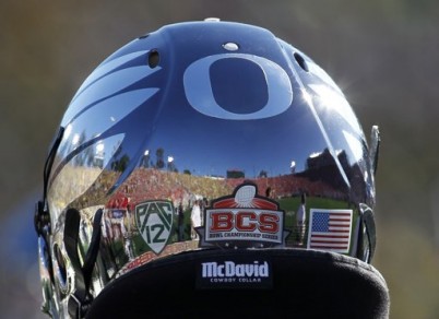 After debuting a shiny metallic helmet with a winged-feather pattern in the Rose Bowl eight months ago, on August 22nd the team unveiled a corresponding new jersey and pant combination. Although the jerseys (coming in green, yellow, white or black) still feature Duck feathers on the shoulders, the style has been changed from the cheeky Greco-Roman soldier feather pattern of the last few years to more of a close-up of feathered plumage.
In this way, the feather pattern looks a bit more elegant, as a kind of second skin for the player rather than Donald Duck fighting Sparta. And the pattern on the shoulders integrates well with the pattern on the helmet, in a way that resembles a comic-book superhero.
The metallic-finish of the Rose Bowl helmet has given way to an array of green, yellow and black helmets with the same winged pattern. It’s still a bit shocking to see the team helmets without the iconic ‘O’ on the side, but the logo remains on the back of the helmets, much like a fuel tank on the back of a Harley Davidson. And indeed, if the classical athletic tradition is one of Oregon’s (and Nike’s) visual cues, so is the motorcycle that leads the team onto the field.
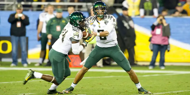
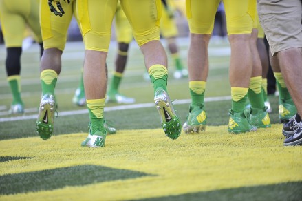
In Saturday’s debut against Arkansas State, the team offered perhaps Nike’s greatest execution of a hybrid between traditional Oregon uniforms predating 1999 and the more dynamic ensembles that have come in the ensuing 13 years. With yellow helmets and pants paired with green jerseys, the kits were a vintage style based on the mid-to-late 1990s days of Akili Smith, Patrick Johnson and Saladin McCullough. Yet the pattern and shine of the metallic wing on the helmet (also shining from shoes and helmet straps), along with the pointy modern shape of the jersey numbers, were unmistakably from the brand identity of today’s Ducks.
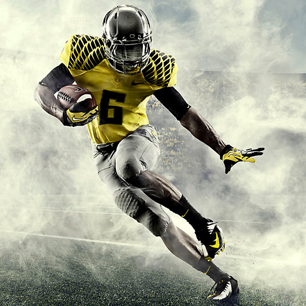
In the weeks ahead, fans will see a much wider variety of combinations, be it yellow jerseys and gray pants (as seen in promotional images unveiled with the August uniform debut), an all-black look as often favored for intense later-season showdowns, an all-green combination favored at many a home game, or some other of the thousands of other possibilities.
One thing nobody has ever accused Nike’s designers of is being too restrained, yet in today’s college football world, with even the most traditionally-bound teams like Notre Dame and Michigan embracing bold choices with new or special-occasion kits, the Beaverton designer is with Oregon’s uniforms actually showing a smart design balance that can’t be seen, for example, in Maryland’s clownish color explosions.
Despite the dizzying array of different combinations Oregon can wear, and despite the intense, almost blinding metallic finish of the helmet wings, we’re otherwise looking at single-color jerseys and single-color pants without any stripes or patterns from the shoulder downward. In effect, the lower 80 or 85 percent of the Ducks uniforms are almost plain.
But that’s not a negative criticism: quite the contrary. The Nike designers seem to grasp that a little boldness can go a long way. (In full disclosure, my partner works for Adidas.)
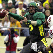 Remember in that first redesign during the Joey Harrington years how the Sharpie-highlighter yellow was deployed only sparingly in a thin stripe and “O” helmet logo against an otherwise dark forest green jersey-pant combo? The company has been at its most successful when unleashing a few lightning strikes of color and patterning against a basic (if infinitely interchangeable) uniform.
Faux patterning is something Nike has favored for years now. Sometimes there may be ill-advised choices: the diamond plating pattern on shoulders and knees during the Dixon and Stewart-led late 2000s, for example, or the blob-shaped pant stripe of the Kellen Clemens-led mid-2000s.
Yet more often than not, the bold moves have been rooted in simplicity, which makes them all the more powerful. The media can tease Oregon about its full-throttle fashions, but Nike’s reinventions (done with player input) have often been successful for designers’ sense of balance.
Brian Libby
Portland, Oregon
Related Articles:
Chip Kelly Update: Everything's Good Again ...
Chip Kelly Update: Wailing and Gnashing of Teeth
Shock and Awe -- The Oregon Ducks' Football Hangover Effect
Despite Lopsided Score, Georgia State "Never Stopped Believing"
Hope Springs Eternal for Ducks
Incompetent Pac-12 Officials: How Do You Miss ALL of THIS?
Brian Libby is a writer and photographer living in Portland. A life-long Ducks football fanatic who first visited Autzen Stadium at age eight, he is the author of two histories of UO football, “Tales From the Oregon Ducks Sideline” and “The University of Oregon Football Vault.” When not delving into all things Ducks, Brian works as a freelance journalist covering design, film and visual art for publications like The New York Times, Architect, and Dwell, among others.

