When Oregon unveiled its 2018 uniforms a few days ago, it was not just a fresh look to christen the Mario Cristobal era. It was coming full circle. Which, if you think about it, is appropriate for a team with an O logo.
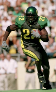
Reuben Droughns
Oregon’s uniform odyssey began twenty years ago this December. On a beach in Honolulu a few days before Oregon’s Aloha Bowl matchup with Colorado in 1998, the athletic department and Nike unveiled a new jersey, helmet and pants design that was a major break from the past.
Gone in that redesign were the yellow helmets, the interlocking UO logo and the use of Kelly green. In their place were green helmets, a new O logo, a dark new shade called forest green that some at first mistook for black, and a stripe leading from the side of the jersey all the way down the pants.
As Joey Harrington led the Ducks that year to a comeback 1999 Sun Bowl win the first season following the redesign, then in 2000 to the team’s first-ever Top 10 finish, and in 2001 to Oregon’s first January bowl win (the Fiesta Bowl) since 1917, the uniforms seemed to reinforce the idea that while Oregon had been a mediocre program for much of its history, the 21st century would be a whole different story. With a new look and new levels of talent, the Ducks had arrived.
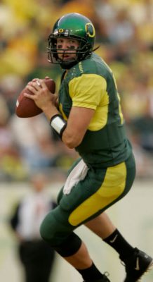
Kellen Clemens and the Blob.
In the ensuing two decades, Oregon would continue to change uniforms every few years. If traditional powerhouses like Notre Dame, Alabama and Penn State retained the same look year after year, the Ducks would own the future: a different look nearly every game.
But with each redesign, the look seemed to get busier and arguably more laden with gimmickry.
In the Kellen Clemens era of the early 2000s, for instance, it was a green jersey with yellow sleeves and a blob of color on the pants in lieu of a stripe. In the Dennis Dixon era, the shade of green became more like brown, and there was now patterning on the shoulders and knees meant to resemble steel plating.
As Chip Kelly took over from Mike Bellotti and Oregon reached new heights, playing in the Rose Bowl in 2009 and then the BCS National Championship in 2010, the team was now wearing jerseys with gladiatorial wings on the shoulders and became as likely to wear black and gray as green and yellow. Under Mark Helfrich, a further refinement came. For the Marcus Mariota era, a pattern of feathers on the shoulders replaced the gladiatorial wings.
Then as Helfrich gave way to Willie Taggart, the team began wearing a series of one-off uniform designs that at times actually had nothing to do with Oregon’s traditional look. There was a black and heather gray design to honor longtime strength coach Jim Radcliffe. There was an all-silver look to honor the Lewis and Clark expedition (!), and a Webfoots jersey-pant combination of blue and black to honor the Ducks’ early 20th century name.
That it came while Oregon was going from a championship-caliber to a losing team didn’t help. Then there were those “lightning” jerseys worn under Helfrich and Taggart, which looked like someone let a toddler scribble with a magic marker on the shoulders. This has been the worst look in Oregon’s history.
Not a fan of the magic-marker scribble…
During these recent years, the team also quietly switched to yet another shade of green, this time apple green, which seemed to go very well with black, but was bright enough that it actually didn’t go as well with yellow.
Nike has on staff some of the greatest designers in the world: men and women who have outfitted athletes around the world in a variety of sports from football, basketball and soccer to tennis, track and baseball.
In many cases, the Beaverton-based company’s apparel design has a blend of boldness and simple elegance that competing brands — Under Armour, Adidas — sometimes struggle to match. Yet Nike also has a mandate to interest consumers in a different look every season: to attract them to what’s fashionable for a fleeting moment. By nature, it’s fickle, like a kid with attention-deficit disorder, always looking for the next shiny object.
For the most part, that constant change has been a good fit for the Ducks, given Oregon’s identity of change. Yet I’m also reminded of a quote from legendary fashion designer Oscar de la Renta: “Fashion is about dressing according to what’s fashionable. Style is more about being yourself.” One might argue that Oregon’s Nike redesigns are already allowing Oregon to be itself: a constant wardrobe changer, the ultimate fashionista of football. But there has to be an underlying style, and that’s what for a time Nike arguably lost sight of with Oregon, particularly as the one-off uniforms began to appear. It was as if Oregon didn’t know who it was anymore.
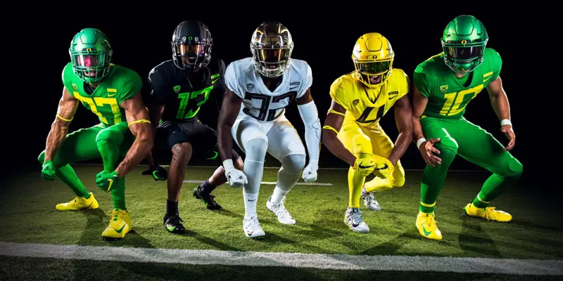
The new Oregon uniforms unveiled by Nike and the athletic department this month, however, represent the team and the designer coming full circle. This new look retains what’s great about the post-1999 redesign while eliminating what wasn’t great. It also — dare I say it — gives a nod to Oregon’s 125 years of tradition.
It’s one of the best uniforms the Ducks will have ever worn.
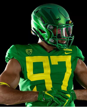
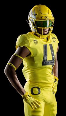
These uniforms can deliver all the interchangeability that fans have enjoyed in the past: green, yellow, black, and (in helmets) silver. And oversized numbers in a very contemporary font give Oregon that graphic boldness that Nike sought with the shoulder patterns, without seeming trite or faux the way those shoulder patterns always did.
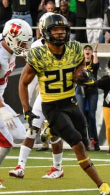
Jalen Jelks and wings on the helmet.
The look also thankfully brings back the winged helmet design, which was one of Nike’s most brilliant designs for Oregon in recent years. We all love that O logo on the helmets, because the logo itself is great (also a hat-tip to Nike). But look around at the legendary programs that have won lots of national championships: Alabama, Penn State, Texas, USC, Florida State. Each of them has a helmet without words. You don’t need to write Alabama on the side of your helmet when you’re Alabama. To do so would be superfluous and insecure.
Not only are Oregon’s jerseys free of the ridiculous faux shoulder patterning, but they are actually once again a shade of green that pops against the yellow. Oregon isn’t calling the shade Kelly green this time — perhaps because the word “Kelly” carries other connotations. But according to the athletic department, the shade is known as “Oregon green,” which is code for saying we’ve gone back to our traditional pre-1999 shade.
That isn’t just an act of nostalgia, but an act of graphic-design smarts. If your two primary team colors are green and yellow, wouldn’t you want to make sure they go together with each other before you consider how either goes with black? Apple green was chosen for its compatibility with black and white jerseys and pants. That’s not the right priority. Oregon can wear black, sure. But black isn’t as important as green.
C’mon. This is a beautiful look!
Some have argued that Oregon’s new look is too plain. And there may be some merit to this argument. Personally, I’d put stripe on the sides of the pants, a traditional stripe from belt to shin, and I’d put a simple stripe on the shoulder, as Oregon recently showed with its Puddles jersey inaugurated two years ago and favored by Willie Taggart last year. Yet the removal of the fake feathers is practically an answered prayer. And again, the big numbers do more successfully what the faux patterning was attempting: leaving us with something bold and memorable.
If Cristobal is successful as Oregon’s head coach, we will see a transition on the field. The Ducks will still score points, and its players will still be lightning fast, but increasingly there is brawn and muscle — the yang to speed’s yin. If the strategy works, it may be what finally puts the Ducks over the top, into the rarefied territory of national championship winners. In a way, it’s combining the best of what Kelly and Helfrich were doing, but it also mixes in a little of the Rich Brooks and early Bellotti DNA — a balanced approach.
In a similar way, these new Oregon uniforms are a kind of ideal: they remember the past even as they embrace the future. This use of traditional Ducks green and yellow, coupled with the winged helmets and the bold numbers, offers a reflection of where the team has come from without losing sight of where the program is headed. It’s the magic formula that Nike, in a certain sense, has been working toward through trial and error for these 20 years.
It’s a vision of the Oregon Ducks as being born from tradition even as new history is made.
Brian Libby
Portland, Oregon
Top Photo from NIKE Sports Twitter
Brian Libby is a writer and photographer living in Portland. A life-long Ducks football fanatic who first visited Autzen Stadium at age eight, he is the author of two histories of UO football, “Tales From the Oregon Ducks Sideline” and “The University of Oregon Football Vault.” When not delving into all things Ducks, Brian works as a freelance journalist covering design, film and visual art for publications like The New York Times, Architect, and Dwell, among others.