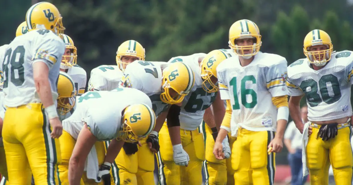
Whoa! Is that background of yellow on the site bright or what? Is it too much? As many of you know, this site is going through a ton of updating and improvement and I would love your feedback. Since this is a Saturday article in the off-season (when there is not as much to discuss) it seemed like a perfect …

