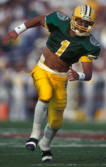
Seventeen years ago, the Ducks football team changed its identity. With a new uniform redesign courtesy of Nike, head coach Mike Bellotti’s troops began the 1999 season looking very different from Duck teams of seasons past. Gone was the interlocking “UO” logo on the helmet in favor of the elegant “O” insignia that remains today. Gone were the yellow pants and helmets in favor of an all-green home jersey, helmet and pants. In its place was a team that felt reborn as a winner.
Uniforms don’t win games. They don’t help athletes run faster, tackle better or hold on to passes they would have otherwise dropped. But as both Nike and Bellotti knew, image matters. It impacts recruiting, which in turn impacts everything that happens on the field. “You should see how much these guys look in the mirror in the locker room,” I remember Bellotti telling me in a Willamette Week interview about the uniforms shortly before that ’99 season began.
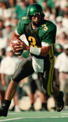
Kellen Clemens and the Blob.
Perhaps not coincidentally, Oregon’s fortunes began to transform along with the uniforms, as the team won a bowl game to conclude that year, only the team’s second bowl win of the decade. The momentum continued in 2000 as the Ducks earned their first 10-win season in school history. And a year after that, in 2001, came Oregon’s first marquee January bowl win since 1916, a Fiesta Bowl triumph that saw the team finish second in the nation in the final Associated Press poll.
In the ensuing years of the 21st century, the Ducks have changed their base uniform design often. The Kellen Clemens years of the early to mid-2000s? That would be the contrasting jersey and sleeve colors, with a blob replacing a stripe on the pants, as well as the first instance of an occasional all-yellow jersey and pants combination. The Dennis Dixon years of the later 2000s? Fake diamond plating on the shoulders and knees, with a shade of green so dark it resembled brown. Darron Thomas era? Feathered gladiatorial wings on the shoulders and an embrace of colors beyond green and yellow, like gray and black.
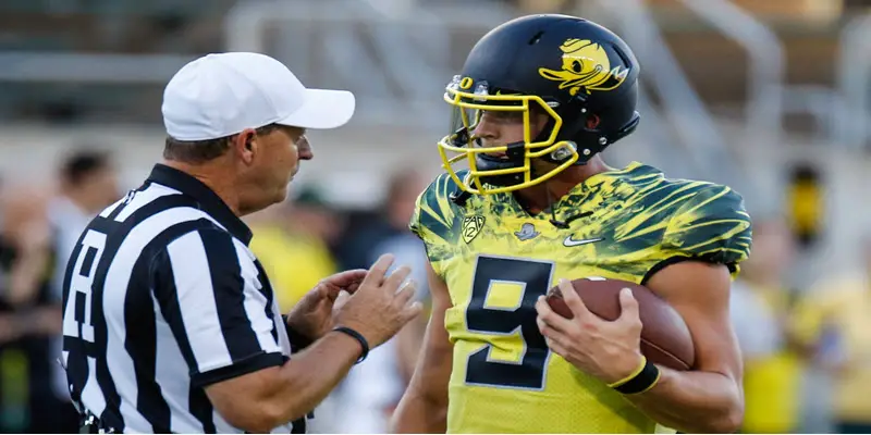
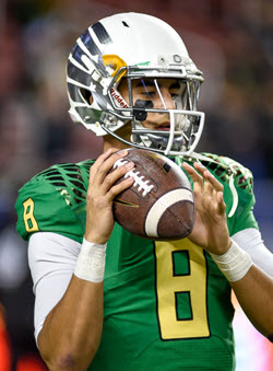
The first two games of this early 2016 campaign have brought two different looks. Against UC Davis in the debut, there was no faux patterning on the shoulder: just good old-fashioned numbers, as the team went with in last year’s Alamo Bowl. Yet there was no green and almost no yellow: instead, black helmets and pants, and a gray jersey that looked like a Hanes undershirt. Against Virginia came the latest version of Oregon’s all yellow combination of jersey and pants and another black helmet.
There was also a new faux patterning on the shoulders, this time referred to as “lightning” – but meant to evoke an explosion of sorts or an abstraction of feathers, perhaps. To my eyes, it looked more like a child’s Magic Marker scribbles. The jerseys felt like a more ill-advised version of what we already had: a change not for the sake of being better, but only for the sake of change itself. And one of the risks of constant tinkering is taking a step backward, like a highway driver who keeps changing lanes to get ahead of traffic but instead slipping behind.
Let me be perfectly honest: although I’ve written about Oregon’s uniforms since that first redesign in 1999, the fact that I’m 44 years old means you can take my criticisms with a grain of salt. These uniforms are designed not to please people like me or even Oregon’s many thousands of season ticket holders, but 17- and 18-year-old football players.
As they should be. While some of Oregon’s uniforms over the years have made me wince (my undying love and passion for the team notwithstanding), we will always take a winner in any jersey. I absolutely loathe those diamond-plating years, for example, but I will always look back at the great players wearing those uniforms proudly – Dixon, Jonathan Stewart, Jeremiah Johnson – with great fondness, admiration and gratitude.
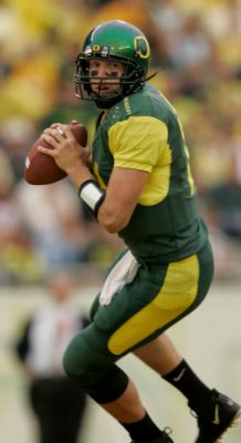
Joey Harrington in the first uniform change …
That said, I can’t help but worry Oregon’s uniform design has backed itself into a stylistic corner. The way forward may come from reframing the problem.
Ever since that first redesign in ’99, the mantra has been newness and change. While the likes of Alabama and Penn State always wear the same plain, traditional uniforms, the thinking has gone, Oregon will do the opposite: wear infinite combinations of different uniforms, with a base design that’s continually changing.
Nike has also been smart to couple stylistic redesigns and physical product innovations. As Oregon’s jerseys have become more admirably breathable and stretchable, those innovations have been framed as unassailable justifications for changes in fashion, which in reality is entirely open to whimsy and fad.
And indeed, Oregon’s array of uniform combinations remains as wide-open as ever. In the first two games of this season, for instance, we didn’t just wear two different color combinations of the same uniform; we wore two entirely different uniforms, one with a relatively traditional style achieving its boldness through an embrace of black and gray over green and yellow, the other a new version of the monochromatic yellow look with a new shoulder pattern.
Yet to my eyes, neither uniform has felt quite right or very original so much as a response to circumstances – which in turn is not very innovative.
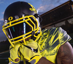
Is the helmet and shoulder cool – or garish?
Meanwhile, the yellow jersey-pants combination against Virginia is more like the uniforms Oregon has worn in years past, with a relatively loud graphic pattern on the shoulders but otherwise a relatively simple look. It’s basically the same approach that Nike has taken with Duck jerseys for roughly a decade, dating back to the faux diamond plating of the Dixon/Stewart era.
It therefore begs the question: is this what innovation and newness have been reduced to? A changing pattern on the shoulders?
As I write this, I hesitate to challenge Nike’s designers to come up with a bolder look, because the best thing about the shoulder patterning is that it has been restricted to the shoulder. Even when you’re going for newness and change, simplicity often makes for the best designs. That’s probably why Oregon’s uniforms aside from the shoulder patterning have become simpler over the years, and more willing to follow basic design rules.
For example, a team can go with or without a stripe on the pants, but the moment a designer tries something non-linear on that outer leg, like a swooping curve (Denver Broncos) or a blob (Clemens-era Ducks), it looks bad. That’s why Oregon has found a happy medium with having words – the name of the school or the team – form that linear pants stripe.
It’s a smart re-imagining of the stripe without abandoning the basic rule of the stripe. And the shoulder patterning on Oregon’s jerseys, be it feathers or diamond plating or so-called lightning, is a way of introducing an eye-catching graphic look within the context of a uniform that otherwise obeys the tenets of good, elegantly restrained design.
It’s also not to say graphic patterns are never a good idea. Great Britain’s track and field uniforms for this year’s Olympics, designed by Stella McCartney for Adidas, featured a large coat of arms comprising most of the front of the shirt. And you know what? It looked pretty good. Yet for me the lightning pattern on Oregon’s shoulders just looks like a tired re-hashing of past shoulder patterns. If Great Britain wore versions of that same coat of arms for the next decade, it would look tired too – and no new graphic pattern would make it better.
We love Cristin McLemore and that classic uniform.
If there is one overriding idea I’d like to leave with any Nike designer or Oregon athletic department decision maker reading this, it’s that schools with traditional uniforms needn’t have the market cornered on simplicity. Having a look with linear stripes and an absence of fake patterning isn’t inherently old school.
If we look to other design disciplines such as architecture, for example, it’s the contemporary buildings that are elegantly simple and sleekly unadorned, while it’s the old buildings that have the extra ornamentation.
What might an ideal Oregon uniform look like, to this old guy’s eyes? It needn’t look much different than what we have today – but with a few key tweaks.
Let the array of helmet emblems – the Donald Duck head, the O logo, the feathered wings – stay. Helmets are the one place on a uniform where graphic imagery is appropriate, and interchanging a few different graphic looks and base colors is what Oregon does best.
Let’s also keep the interchangeability of the differently matched jersey, helmet and pant colors. And since I’m feeling generous, we can also keep some of those non-Oregon colors like black, gray and silver. Just don’t make them the dominant colors or rely on them to the degree that we rarely see green and yellow together.
Although the shoulder patterning is quite tired at this point, even it can be still be rendered well, so long as it’s faint. As I write this, I can look to my framed pictures of past Duck triumphs on my wall for good examples. In the 2011 season’s culminating Rose Bowl win against Wisconsin, there was a shoulder patterning but it blended in with the base color so it didn’t stand out too loudly. Same goes for Oregon’s other Rose Bowl win, at the end of the 2014 season against Florida State. The patterning was there but from a distance the jersey read as simple and all green. And it looked great.
Shoulder patterning can also look good if it is more of a geometric pattern, either on the top of the shoulder, as Oregon does, or as part of the edge of the sleeve, as is the case with teams such as Arizona and Syracuse. Part of my problem with the new shoulder patterning is that it looks more photographic than patterned, and thus, more of a visual mess. It reminds me too much of my least-favorite uniform pattern: the Cincinnati Bengals.
Marcus Mariota in 2014.
While it’s good to maintain the interchangeability, Oregon should also give those changing looks a foundation that remains constant. Having uniforms from week to week that change out yellow jerseys for green, or white pants for gray, is just fine. But the basic design from the first to the second game this year changed entirely, making the Ducks seem not like a ship hitting many scheduled ports of call but of one that is rudderless and adrift.
Just as head coach Mark Helfrich has tweaked his strategy and made minor changes to his coaching staff in his years at the helm without an outright break from the spread-offense philosophy of his predecessor and former boss, Chip Kelley, so too does Oregon’s look need a tweak or two and a breath of fresh air more than it needs an outright reinvention.
Oregon and Nike have done a whole lot right with the team’s uniforms over the past 16 years – vastly more right than wrong. This success has no doubt helped the team’s on-field rise. What will strike the best balance, though, is a uniform that is apologetically contemporary without seeming dated soon afterward – a uniform that doesn’t just call attention to itself loudly but, like a great program’s fortunes, endures over the decades. We’ve achieved that numerous times before, and I’m confident we will again.
Brian Libby
Writer for FishDuck.com
Portland, Oregon
 FishDuck Note: Brian is modest and does not tell us that he is a professional writer who contributed this for fun, but he did write a wonderful book about Oregon football that I highly recommend as a birthday/Christmas present. Being so busy, he cannot write for us often, but I am a big fan of his work and am very grateful. Charles Fischer
Top Photo by Gary Breedlove
Related Articles:
Brian Libby is a writer and photographer living in Portland. A life-long Ducks football fanatic who first visited Autzen Stadium at age eight, he is the author of two histories of UO football, “Tales From the Oregon Ducks Sideline” and “The University of Oregon Football Vault.” When not delving into all things Ducks, Brian works as a freelance journalist covering design, film and visual art for publications like The New York Times, Architect, and Dwell, among others.
